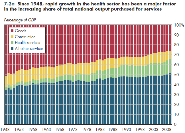
Since 1948, more than 40 percent of the growth in the services share of the economy can be attributed to the rapid growth in health services (figure 7.3a). America has become a service economy, with an expanding health sector an important driver of that trend. Some components of personal health care are counted as goods (pharmaceuticals, non-durable medical products, and durable medical equipment) and other components of national health spending fall under construction. The rest is labeled health services in figure 7.3a.

Final demands take into account personal consumption by households, government purchases, and private and public investments. From 1948 to 2009, all services excluding health grew from just over 30 percent of the economy to more than 50 percent. Thus, the shift to services would have happened — albeit less rapidly — even had health services remained at its 1948 level of 3 percent of GDP. Services now constitute almost 65 percent of final purchases, but an ever-increasing share of that is accounted for by health care. Currently, that share is more than 20 percent of all services, compared with only 6 percent in 1929.
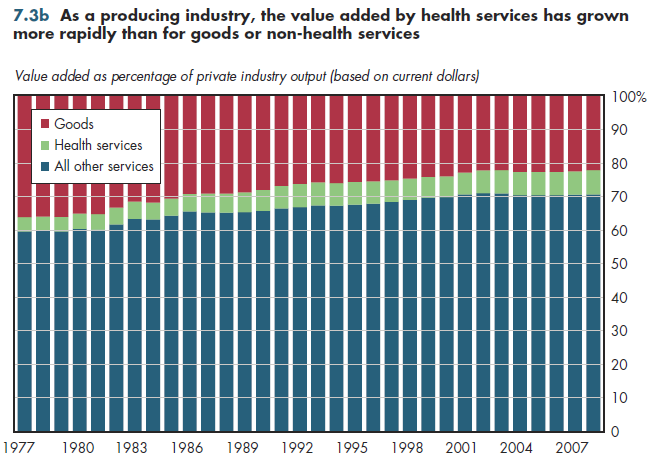
Another way to decompose total output (GDP) is in terms of the industries that produce it. The consumer who purchases health care — a final demand — might rely on the output of many other industries such as transportation, real estate, finance, and manufacturing. Value added is simply an industry's gross output minus all the resources produced by other industries that were used to create it. In this view, the share of output attributable to goods equals the value added from the industries that supply the goods. These include agriculture, forestry and fisheries, mining, construction, and manufacturing. In this alternative way of breaking down output, all other industries are classified as services.
Unfortunately, detailed value-added data are available only for private output, so the scenario is incomplete. Services overall account for almost 80 percent of private business output (figure 7.3b). The health services contribution is much more modest and growing much less rapidly from this producer view (i.e., "supply-side" view) than the demand-side perspective described previously.

Download Excel workbooks used to create
Figure 7.3a Table and
Figure 7.3b Table.
[Note that you’d have separate links for each set of tables] Figures 7.3a and 7.3b were created from the following tables (the workbook includes all supporting tables used to create these tables):
- Fig. 7.3a: Table 7.3.1. Gross Domestic Product by Major Type of Product, 1929-2009
- Fig. 7.3b: Table 7.3.2. Private Industries Value-Added for Selected Goods and Services, 1977-2012
Download PowerPoint versions of both figures.
- Department of Commerce. Bureau of Economic Analysis.


