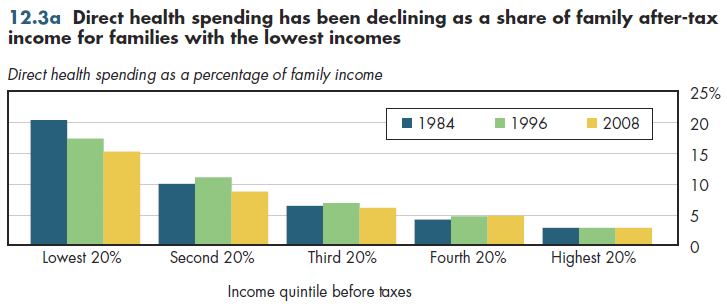
Over the past 25 years, the direct visible burden of health spending has decreased for those in the lowest fifth of households ranked by income (figure 12.3a). For those in the higher income brackets, this burden has increased slightly (second highest quintile) or remained stable (top quintile). These data count only out-of-pocket spending and direct premiums paid by the family.

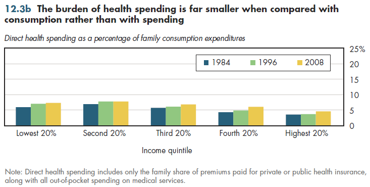
Moreover, a different scenario emerges if measures include health spending relative to annual consumption expenditures instead of income (figure 12.3b). Incomes can greatly vary from year to year and many economists believe that actual expenditures more closely reflect a family's permanent income. That is, if a family experiences a decline in income perceived to be temporary (for example, a lost job or a decision to return to school), it likely will borrow temporarily to avoid a steep decline in lifestyle that otherwise would result from limiting spending to income. From this perspective, the direct health spending burden is quite similar across households with widely varying incomes. However, according to this measure, this burden also has been rising for most income groups.

Note that switching from income to consumption reduces the burden in the lowest income quintile by approximately eight percentage points. This reduction would be even larger for the lowest decile rather than quintile because, by necessity, anyone who has a negative or zero income would be forced to borrow. Thus, the 40 percent net burden shown previously would be much lower using an arguably more accurate measure of permanent income.
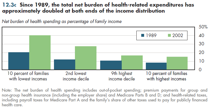
The most complete way to look at burdens considers both hidden and unhidden costs and subsidies. One snapshot used methods similar (though not identical) to the net burden estimates described previously in figure 12.2a. Interestingly, this 1989 analysis also found approximately a two-and-a-half to one ratio between the net burden at the bottom compared with the top 10 percent of the income distribution (figure 12.3c). The absolute level of these burdens was approximately half the levels observed in 2002. The net burden rose almost equally across the income distribution. Consequently, the relative burden grew neither larger nor smaller during this period. No good way exists to determine whether this pattern is typical for the period that preceded it, or whether it has continued until the present.

Download PowerPoint versions of all figures.
- Department of Health and Human Services. Agency for Healthcare Research and Quality.
- Department of Labor. Bureau of Labor Statistics.
- Holahan J and S Zedlewski. Who Pays for Health Care in the United States? Implications for Health System Reform. Inquiry 1992; 29:231-48.
- Selden TM. Using Adjusted MEPS Data to Study Incidence of Health Care Finance. Agency for Healthcare Research and Quality. http://www.ahrq.gov/about/annual conf09/selden/selden.ppt (accessed July 16, 2010).


