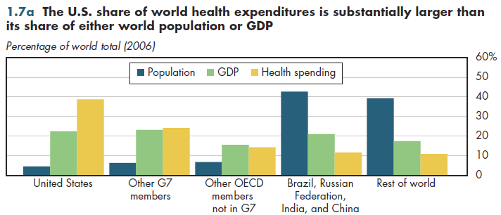
Even from a world perspective, the American health system is massive, accounting for approximately 40 percent of an estimated $5.2 trillion in health expenditures across the globe (figure 1.7a). This share is far higher than the U.S. share of worldwide gross national income (GNI) — a sharp contrast to the rest of the G7, where the shares are almost equal. These calculations are based on estimates by the World Health Organization (WHO). In most countries, GNI is approximately equivalent to GDP so it is a reasonable approximation of national output. However, to equalize purchasing power, WHO estimates health spending using the rough equivalent of GDP PPP. As noted previously, this approach tends to overstate relative U.S. health spending. The difficulties noted about making international comparisons of output in general (or health sector output in particular) are even more severe when countries as different as the United States and Ethiopia are involved. Despite such measurement problems, there is no doubt that differences in per capita income and health spending are extremely large.

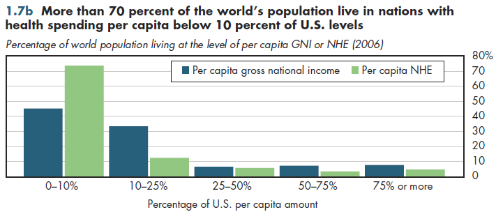
The concentration of world population in the group with fewer than 10 percent of U.S. per capita income and health spending is magnified by the inclusion of China and India, where almost 40 percent of the world's population reside (figure 1.7b). This group also includes four of the world's most populated countries (Indonesia, Bangladesh, Pakistan, and Nigeria).

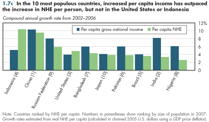
Among the world's 10 most populated countries, recent growth in per capita income has exceeded that in the United States, implying a shrinking income gap. In contrast, with the exception of Indonesia, China, and the Russian Federation, NHE per person has grown less rapidly in all of these nations compared with the United States (figure 1.7c). These three nations increased health spending relative to the United States while the others fell further behind. However, except for Indonesia, health spending growth has been slower than growth in income.

The OECD has compiled reasonably good data over decades; however, health spending data in some of these developing countries is much more uneven in quality and spans a much shorter timeframe. Reaching strong conclusions from growth differentials observed over only five years would be wrong.
Download Excel tables used to create both figures:
Figures 1.7a/1.7b Tables.
Figures 1.7a, 1.7b, and 1.7c were all created from the following table (the workbook includes all supporting tables
used to create this table):
- Fig. 1.7a: Table 1.7. Population, GDP and National Health Expenditures (PPP international dollars), by
Country: 1995-2009
- Fig. 1.7b: Table 1.7.2. Index of Per Capita Gross National Income and NHE (U.S. = 100), by Country: 2009
- Fig. 1.7c: Table 1.7.1. Per Capita GDP and National Health Expenditures (PPP international dollars), Index
per Capita (U.S.=100) and Thirteen-Year Annual Growth Rate, by Country: 1995-2009
Download PowerPoint versions of both figures.
- Author's calculations.
- World Health Organization.


