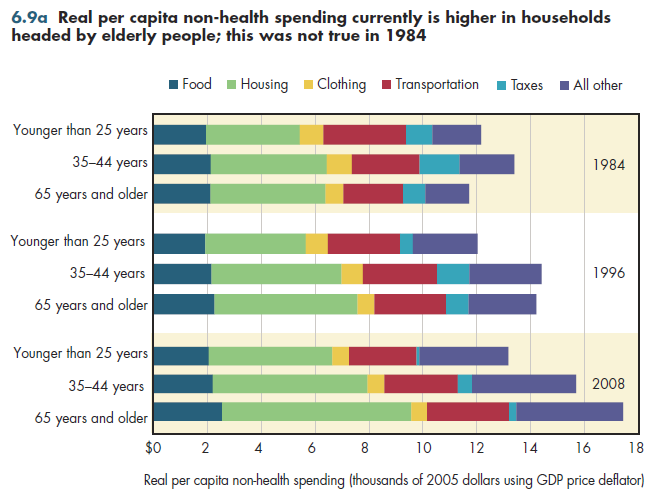
Although households headed by those 65 and older spend a higher fraction of their income on health care, the per capita resources left over to spend on everything else are higher than in households headed by the non-elderly (figure 6.9a). This might seem counterintuitive, but it has occurred because growth in real total spending in elderly households has outpaced that of younger households over the past 25 years. Note that these numbers are based on household surveys of consumer expenditures that reflect actual spending on health care (out-of-pocket costs and premium spending by each family).

In terms of constant purchasing power, elderly households 25 years ago lagged behind households headed by younger adults in terms of the amount available per capita for all other consumption except health. By 1996, per capita non-health consumption for the elderly outpaced that of the youngest households by more than $2,000—a gap that grew to $4,000 by 2008. This demonstrates the importance of comparing health spending burdens across households both in relative terms (per - cent of income or expenditures) and as absolute dollar amounts (both health and non-health spending).
To summarize, this increase in consumption by the elderly resulted in higher health spending (shown previously) and higher spending in almost all categories of non-health spending.
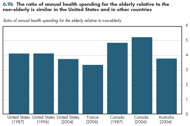
Unfortunately, comparative data on elderly health spending relative to non- elderly spending is sparse. In the United States, this ratio is approximately the same as that in other European countries, but markedly lower than in Canada (figure 6.9b). Taken at face value, it appears that this ratio is declining in the United States while increasing in Canada. Such sparse data do not allow strong conclusions about any trends. The recently enacted health reform law likely would reduce this ratio further because, on balance, it increases spending mostly for non-elderly uninsured while reducing expenditures for Medicare. Thus, why the ratios would be so divergent in countries having near-universal coverage is somewhat puzzling.

Download Excel workbooks used to create
Figure 6.9a Table and
Figure 6.9b Table.
[Note that you’d have separate links for each set of tables] Figures 6.9a and 6.9b were created from the following
tables (the workbook includes all supporting tables used to create these tables):
- Fig. 6.9a: Table 6.9.1. Health Care Spending as a Share of Average Annual Personal Consumption Expenditures, By Householder Age, 1984, 1996, and 2008
- Fig. 6.9b: Table 6.9.2. Ratio of Health Spending Per Capita for Elderly Relative to Non-Elderly: 1987, 1996, 2005, 2004, 2006
Download PowerPoint versions of both figures.
- Author's calculations.
- Department of Labor. Bureau of Labor Statistics.
- Organisation for Economic Co-operation and Development.


