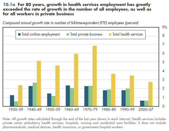
In every decade since the 1930s, total health services employment has increased two to three times as fast as the number of workers in the general economy or private business (figure 10.1a). The numbers exclude workers in the goods-producing part of the health industry, along with employment by health insurers. It is uncertain whether inclusion of such workers would appreciably alter the data. Because the general population grows at approximately 1 percent a year, the numbers in figure 10.1a also illustrate the ratio of health services growth to the overall population. In none of those 80 years has health sec- tor growth been less than two percent a year; in the 1970s, the annual increase reached almost seven percent. These general trends are quite consistent with previous information about growth in health care expenditures relative to the economy (refer to figure 1.5a).

In light of the surge in spending that occurred in the aftermath of the arrival of Medicare and Medicaid in the mid-1960s, the extremely high relative growth in health sector employment might not be surprising. However, even in the 1950s, the health sector work force also grew three times as quickly as employment in private businesses overall. The 1980s were characterized by increasing concerns about rising health expenditures; indeed, this became an important issue in the 1992 election and a failed effort at health reform in 1993-94. Conversely, the late 1990s saw a noticeable slowdown in health spending, yet that increase in health industry employment relative to the rest of the economy during that decade was practically the mirror image of the pattern in the 1980s.
Since 2000, growth in health sector employment reached its lowest level since the 1930s in absolute terms. Yet this growth rate nevertheless was triple the rate of increase in both overall civilian employment and private business employment during that period.
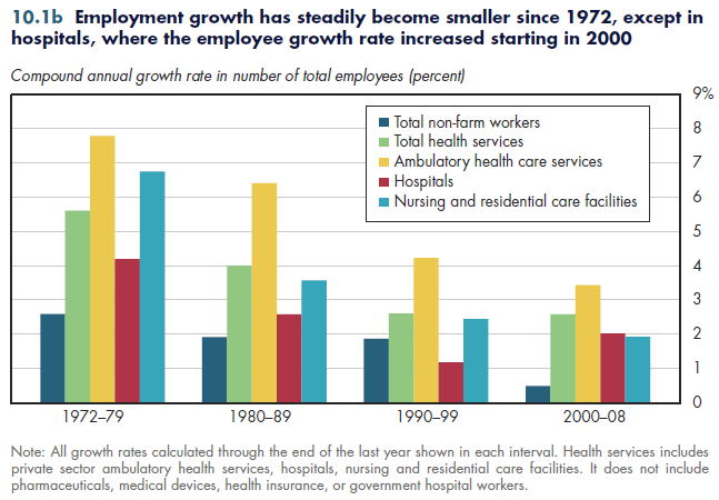
Employment consistently has grown faster in ambulatory health services than in health facilities (figure 10.1b). The annual rates of increase for all services except hospitals has declined for each of the snapshots shown in the figure. However, the rate of increase became larger for hospitals, but the absolute rate of increase for hospitals is lower than for ambulatory health services for all years, even 2000-2008. The introduction of Medicaid fueled a nursing home boom that lasted more than a decade.

Download PowerPoint versions of both figures.
Download Excel workbooks used to create
Figure 10.1a Table and
Figure 10.1b Table.
[Note that you’d have separate links for each set of tables] Figures 10.1a and 10.1b were created from the following tables
(the workbook includes all supporting tables used to create these tables):
- Fig. 10.1a: Table 10.1.1. Average Annual Growth in Employment for Detailed Components of Health Sector and Total U.S. Employment, by Decade, 1929-2011
- Fig. 10.1b: Table 10.1.2. Average Annual Growth in Employment for Detailed Components of Health Sector and Total U.S. Employment, by Decade, 1970-2008
- Author's calculations.
- Department of Commerce. Bureau of Economic Analysis.
- Department of Labor. Bureau of Labor Statistics.


