Download PowerPoint versions of both figures.
Inside Collection (Textbook): Chapter 19: Do Americans Get Good Value for Money in Health Care?
19.4 US Health Spending per Capita Is Not Far from Expected
Summary: Health spending per capita in the United states is not necessarily more than expected relative to the pattern seen in other industrialized countries.
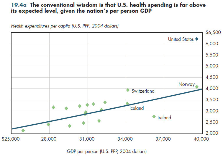
There is a widespread perception that the United States spends "too much" on health care. Health care is a "normal" good. As incomes increase, so does consumption of health care. Thus, an important reason that the United States has much higher health spending per person is that it also has much higher GDP per person than most other countries have. The relationship between income and health is sufficiently tight that income alone explains approximately 90 percent of the differences in health spending across countries. A statistical prediction line is one that best fits income versus health spending data for OECD countries. The United States is far above its predicted value when using such a line (figure 19.4a).

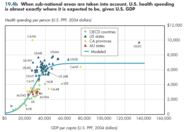
The United States is a huge country that dwarfs many of the industrialized countries of Europe, Asia, or North America. For example, if the U.S. states were countries, six would rank among the top 20 countries in the OECD in terms of GDP. Health spending per resident varies by a factor of two to one across states. Separating U.S. states (including D.C.), 13 Canadian provinces, and seven Australian states/territories, the relationship between GDP per capita and health spending per capita changes considerably (figure 19.4b). Both Nunavut in Canada and D.C. are clear outliers. Calculating the best-fitting prediction line that ignores these outliers, the line increases initially but eventually plateaus. (Were the outliers included, this line would continue to rise although much slower than as illustrated in figure 19.4a.)

This alternative S-shaped line in figure 19.4b fits the data better (it explains more of the spending variation) than does the line in figure 19.4a. Although U.S. states are both above and below the line, health spending per capita for the United States as a whole is almost exactly on the prediction line. The small difference between actual and predicted health spending illustrated in figure 19.4b does not prove that the nation's health spending is what it "should" be nor does the large difference in actual and predicted health spending in figure 19.4b. The size of the difference is sensitive to the assumed shape of the prediction line. Reasonable people can disagree about which shape more accurately predicts where other countries will be when they reach the U.S. level of GDP per capita.
Downloads
References
- Eyermann C. Redefining the Health Care Debate—Part Two. Political Calculations. http://politicalcalculations.blogspot.com/2009/07/redefining-health-care-debate-part-2.html (accessed September 1, 2010).
- Organisation for Economic Co-operation and Development.
Collection Navigation
- « Previous module in collection 19.3 Medicare Spending & Spending Growth Vary Substantially across Geographical Areas
- Collection home: Chapter 19: Do Americans Get Good Value for Money in Health Care?
- Next module in collection » 19.5 Increased US Health Spending Cannot Be Explained by Health Services Use
Content actions
Give feedback:
Download:
Add:
Reuse / Edit:
Twin Cities Campus:
- © 2012 Regents of the University of Minnesota. All rights reserved.
- The University of Minnesota is an equal opportunity educator and employer. Privacy
- Last modified on Sep 24, 2013 3:31 pm -0500


