Without exception, in all so-called advanced countries, NHE accounts for a larger share of GDP today than it did 50 years ago. Each 1 percent increase in GDP has been associated with approximately a 1.3 percent increase in health spending. This proclivity to devote a bigger share of rising GDP to gains in health status might make the growing share of GDP allocated to health care appear "inexorable"; however, it is not inevitable. In some countries, the health share of GDP has declined or remained relatively flat for periods of years.
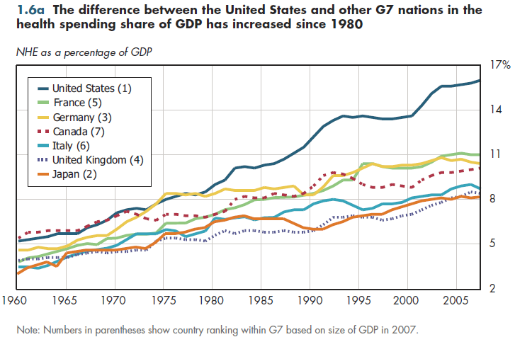
In the early 1960s, the health sector share of U.S. GDP was much more similar to that of its major competitors than it is today (figure 1.6a). Inferring from these changes that the United States spends "too much" or that other G7 nations spend "too little" on health care is inappropriate. In 1980, real GDP per capita (using 2005 dollars and purchasing power) was lower in every other G7 nation than in the United States—a difference ranging from 11 percent (Canada) to 25 percent (Italy). From 1980 to 2007, real GDP per capita grew faster in the United States than in all G7 countries except the United Kingdom. This combination—a higher base level of per capita GDP and faster growth—permitted the United States to afford a much higher increase in health spending.

What does this mean? In 1980, real non-health GDP per capita in all other G7 countries was lower than in the United States Yet with the exception of the United Kingdom (where such spending grew from 71 percent of the U.S. average in 1980 to 82 percent by 2007), the U.S. margin of advantage in non-health spending had increased in 2007 relative to 1980.
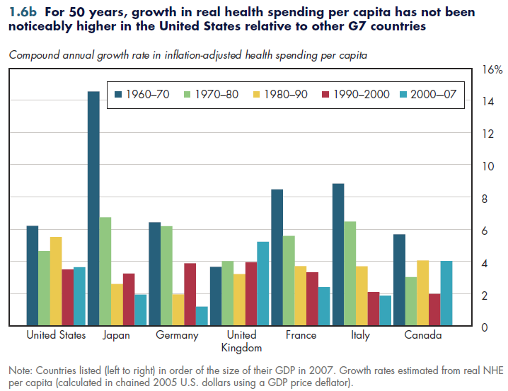
Moreover, growth in real NHE per capita has not been persistently higher in the United States relative to its major economic competitors (figure 1.6b). That is, even though health spending growth outpaced GDP growth by a greater extent in the United States than in other G7 nations, it did not become relatively less affordable in terms of GDP purchasing power. This fact illustrates the importance of making apples-to-apples comparisons when assessing the relative performance of different health sectors. Chapter 19 explores how well the American health system performs in obtaining value for money in health care.

Download Excel workbooks used to create
Figure 1.6a Tables and
Figure 1.6b Tables.
[Note that you’d have separate links for each set of tables] Figures 1.6a and 1.6b were created from the following
tables (the workbook includes all supporting tables used to create this table):
- Figure 1.6a: Table 1.6. National Health Expenditures as a Percent of GDP, Selected Industrialized Countries:
1960 to 2008
- Figure 1.6b: Table 1.6.3. Real NHE Per Capita (chained 2005 U.S. dollars), Selected Industrialized
Countries: 1960 to 2007
Download PowerPoint versions of both figures.
- Author's calculations.
- Organisation for Economic Co-operation and Development.


