Download PowerPoint versions of both figures.
19.15 The Challenge of Comparing US States
Summary: Comparing health system performance across U.S. states poses many of the same challenges as do comparisons across countries.
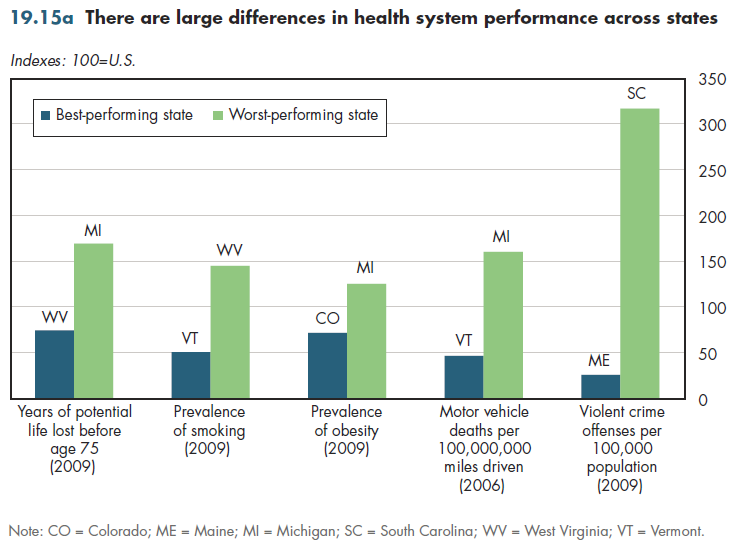
The variation in health outcomes across states has been an important theme in this section. Some side-by-side comparisons of selected indicators that have been used to rank the performance of states are illustrated in figure 19.15a. Here, the word "performance" recognizes that differences in these indicators might not reflect the quality of medical care delivered in the states. Some indicators such as traffic fatalities better reflect state performance on other dimensions (for example, highway safety) than on health care.

To facilitate comparisons, each indicator has been indexed to the U.S. average for that indicator. This makes it easier to see that the worst performing states on a) years of potential life lost before age 75, b) smoking prevalence, and c) the rate of motor vehicle deaths have rates that are approximately 50 percent higher than the national average. Two conclusions can be drawn from these comparisons.
First, the relative sizes of the differences between states varies widely by indicator. There is only a 75 percent difference between the state that has the highest obesity rate compared with the state that has the lowest. In contrast, there is a 12-fold difference between the states that have the highest and lowest rates of violent crime offenses per 100,000 residents (which include homicides, rapes, robberies, and aggravated assaults).
Second, there is not always much symmetry in how the highest- and lowest- performing states compare with the national average. The state that has the highest obesity rate exceeds the national average by only 25 percent while the best-performing state has an obesity rate 28 percent less than the average. Similarly, the highest state-level smoking rate is 45 percent above the U.S. average, and the state with the lowest rate is 49 percent below that average. The other indicators display more asymmetry. The state with the most years of potential life lost (YPLL) is 69 percent above the national average, but the state with the lowest YPLL is only 25 percent below that average. Rates of violent crimes exhibit the greatest asymmetry.
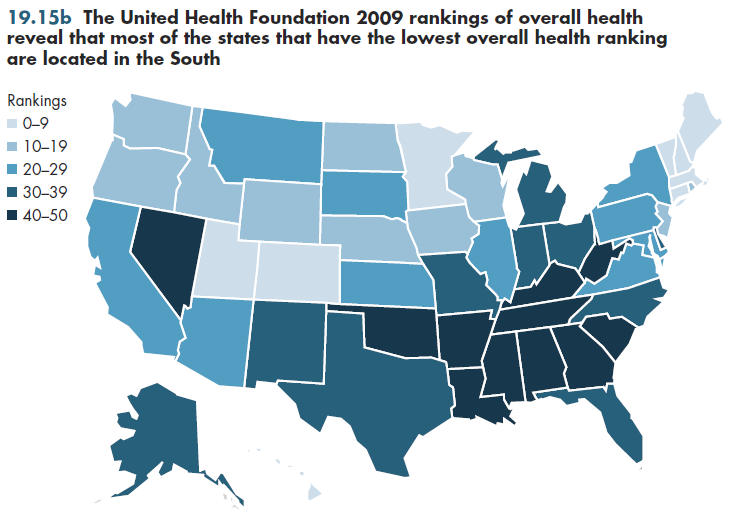
State rankings (figure 19.15b) therefore depend heavily on what factors are included and the weights given to each factor.

Downloads
Content actions
Give feedback:
Add module to:
Reuse / Edit:
Twin Cities Campus:
- © 2012 Regents of the University of Minnesota. All rights reserved.
- The University of Minnesota is an equal opportunity educator and employer. Privacy
- Last modified on Oct 18, 2013 2:23 pm -0500


